“What made Saul Bass one of the most influential graphic designers of his time?”
by rebekah Leonard
Introduction
Cinema has come a long way since the first ever motion picture film that only lasted 2 seconds. A fundamental element of cinema besides the movie is the title sequences and movie posters which in today's world play such a large part in creating the tone and atmosphere of the movie before it has even begun. This is something we can thank pioneer of modern title sequences, Saul Bass for.
Early Life
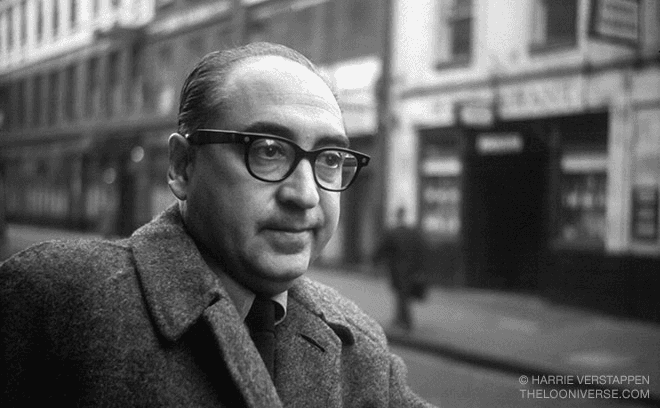
Born into a household of Jewish eastern-European immigrants in the Bronx, New York on the 8th of May 1920, Bass was always encouraged to be creative and create art by his parents. Growing up during the Great Depression meant that after he left high school he could only study part time at the Art Students League in Manhattan as he had to work at an advertisement agency to make money. (Area of Design, 2019b)
While continuing to work, he attended the Brooklyn College where he was taught by master of the Bauhaus aesthetic, Hungarian designer, Gyorgy Kepes. The mentoring of Kepes allowed Bass to expand his skills and begin freelance work for several companies such as Warner Bros. In 1946, he moved to Los Angeles to start designing print advertisements, collaborating with film directors such as Otto Preminger and in 1952 establishing his own private firm, Saul Bass & Associates.
Saul Bass’s first taste of success was when he designed the movie poster for the Preminger’s 1954 film ‘Carmen Jones’ for which he also later created the title sequence. This was when Bass realised the potential of movie titles and how they enhance a viewer’s experience, setting the tone and their emotions. (Miller, 2021).

Movie Posters
Bass created over twenty-five movie posters that were used for commercial use throughout his career for film makers such as Alfred Hitchcock, Billy Wilder, Martin Scorsese and Otto Preminger. Bass’s style was very minimalistic; he had a notable talent of using negative space to compliment the centre images as well as using black and white alongside brighter and bolder colours that stand out, such as red. (Saul Bass, n.d.)
He established this style in 1954 when creating the ‘Carmen Jones’ movie poster for Otto Preminger. The poster featured a black and white image of Dorothy Dandridge, the lead actress accompanied by hints of red on her lips and skirt which he used to reflect her fiery persona in the movie. Bass aimed to portray the fiery personality of Carmen Jones through his poster as up until this time most posters reflected the romance of films, a pattern Saul Bass hoped to break. (Saul Bass, n.d.-b)
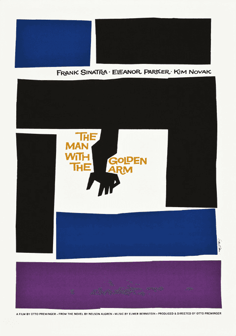
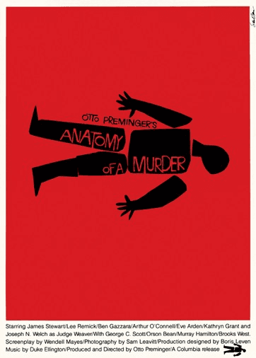
Bass continued to use his minimalistic style and graphical layouts when working on movie posters such as ‘The Man with the Golden Arm’ and ‘Anatomy of a Murder’ for English Filmmaker Alfred Hitchcock. His posters had a unique approach for the 1950’s using a single graphic or image on the poster to help set the theme and tone of the movie. “The Man with the Golden Arm” used only geometric shapes to create a crooked arm look accompanied by a sans-serif typeface for the title. Both pieces are exemplary pieces which display Bass’s amazing ability to create simple visuals that speak so many words while displaying so little visually.


Title Sequences
Thomas Edison introduced the title sequence in 1897 to prevent piracy, creating the cinematic tradition of opening titles in 1908 for the film ‘Bronco Billy’. Title sequences were irrelevant to the world of cinema up until the 1950’s, as the opening titles played as the curtain rose and many of them were the same content just slightly adjusted to the theme of the movie. (Miller, 2021).
In 1954, with the release of Carmen Jones, Bass wanted to change the outlook on opening titles and create one that would provide additional content to the films story. Saul Bass worked alongside Carmen Jones producer Preminger to write letters to theatres asking them to help make opening titles a fundamental part of cinema by raising the curtains before playing the titles and allowing the viewers to get a feel of the movie before it even begins. (Crook, 1986) Bass’s work for Carmen Jones was the first example of his exquisite work which ran smoothly as if it had a beginning, middle and end all based around a single symbol or icon that represented each film. His innovation to use the opening seconds of a movie as a prologue to create the mood, set the tone and build an underlying story (Meggs, 1997) has made Bass the admired designer he is seen to be today, having worked on films for Oscar Preminger and Alfred Hitchcock such as North by Northwest, Vertigo, Psycho and The Man with The Golden Arm.
By 1970, such a significant impact had been made with more cast and crew getting credited for their roles in the opening titles, so much so they had to create end credits, so the opening titles were not so long. Although today the main title sequence is found at the end of the movie, normally in an animated form alongside the end credits. The integral opening title sequence of Saul Bass remains in the form of a recap, a backstory or a sequence with the main actor's names.
"My initial thoughts about what a title can do was to set mood and the prime underlying core of the film’s story, to express the story in some metaphorical way. I saw the title as a way of conditioning the audience, so that when the film actually began, viewers would already have an emotional resonance with it.”
– Saul Bass (Area of Design, 2019)
Cooperate Logos
After his cinematic breakthrough in the seventies, Bass averted his attention from cinema to corporate logos creating well-known logos such as Kleenex, Quakers Oats and United Airlines. The average lifespan of a commercial logo created by Saul Bass is 34 years with most logos using the original logo today with only minor adjustments or the ones that are different still reflect the original design principles. (99Designs – Saul Bass, n.d.) This just shows how Bass’s signature simplistic and minimalistic style really has stood the test of time as it continues to look modern today despite style always changing.
In 1968, Saul Bass alongside his wife Elaine created a 26-minute short film pitch titled ‘Why Man Creates’ (Channel, 2011) to create a new brand identity for the Bell System. The Bell System was introduced in 1877 and used multiple telephone exchanges throughout North America. (Bell System Logo Logo and Symbol, Meaning, History, PNG, n.d.). The overall look of the logo was extremely minimalistic and modern and not anything like what other designers were producing in the late sixties. Although The Bell System disbanded in almost 40 years ago in 1984, the logo could still be used today due to its contemporary look which just proves Saul Bass skill to create logos which could still be used for years to come.

Impact
The movie poster and title sequence designs were revolutionary and created change back in the 1950s but Bass’s work has also shaped cinema into what it is today. He has changed peoples outlook on how movie posters and sequences create a tone and start the story using the simplest type and imagery and helped transform film advertising.
One of his most influential moments of his work being when he made it compulsory for title sequences to be played after the curtain had rose. Today the main title sequence has moved to the end containing a list of the whole cast and crew, but Bass’s title sequence still exists at the start naming the main actors and film cooperation. Not only did Saul Bass change the way the world perceived a title sequence, but he taught designers to rethink the complexity in their designs. He wanted his designs to be so minimalistic that they were always open to interpretation.
It is sure that the foundations of his work will be present in cinema for years to come as more films are produced and the creative technologies are advancing every day. There is no doubt Saul Bass legacy will live on and continue to inspire upcoming designers.
References
bibliography
Arif, I. (2018, May 4). Saul Bass Anatomy of A Murder - FGD1 The Archive. Medium. Retrieved December 6, 2022, from https://medium.com/fgd1-the-archive/saul-bass-anatomy-of-a-murder-8f4cd471479e
Bell System Logo Logo and symbol, meaning, history, PNG. (n.d.). Retrieved November 22, 2022, from https://1000logos.net/bell-system-logo/
Channel, A. T. (2011, November 30). AT&T Archives: Saul Bass Pitch Video for Bell System Logo Redesign [Video]. YouTube. Retrieved December 5, 2022, from
https://www.youtube.com/watch?v=xKu2de0yCJI&feature=youtu.be
Crook, G. (1986). Changing Image: Television Graphics from Caption Card to Computer. Last Accessed December 5, 2022
Demogornyan, D. (2018, October 21). Graphisms , Typography , Infographics and Design - The Godfather - Saul Bass - Non-Alamo Graphic Art Movie Posters - CoDesign Magazine | Daily-updated Magazine celebrating creative talent from around. . .. Pinterest. Retrieved December 6, 2022, from https://www.pinterest.co.uk/pin/568016571749972761/
design-is-fine. (2015, June 17). design-is-fine. Tumblr. https://www.design-is-fine.org/post/121779828205/saul-bass-poster-artwork-for-billy-wilders-movie
Dunn, T. (2018, December 2). Empire State Building, New York City during daytime. Unsplash. Retrieved December 5, 2022, from https://unsplash.com/photos/rfj_wOYQkus
File:Carmen jones.jpeg - Wikimedia Commons. (1954). Retrieved December 6, 2022, from https://commons.wikimedia.org/wiki/File:Carmen_jones.jpeg
Kennisgeving voor omleiding. (n.d.). Retrieved December 6, 2022, from https://www.google.com/url?sa=i
Meggs, P. (1997). Six Chapters in Design: Saul Bass, Ivan Chermayeff, Milton Glaser, Paul Rand, Ikko Tanaka, Henryk Tomaszewski (1st ed.). Chronicle Books. Last Accessed December 5, 2022
Miller, A. (2021, October 13). Why a Film’s Opening Title Sequence Matters. No Film School. Retrieved November 22, 2022, from https://nofilmschool.com/title-sequence-matter
MovieTitles, mm. (2017b, November 28). Saul Bass: North by Northwest (1959) title sequence. YouTube. Retrieved December 7, 2022, from https://www.youtube.com/watch?v=1ON67uYwGaw&feature=youtu.be
MovieTitles, M. (2017, September 25). Saul Bass: Carmen Jones (1954) title sequence [Video]. YouTube. Retrieved December 7, 2022, from https://www.youtube.com/watch?v=I0OkcWIeg40&feature=youtu.be
MovieTitles, M. (2017b, October 30). Saul Bass: Psycho (1960) title sequence [Video]. YouTube. Retrieved December 7, 2022, from https://www.youtube.com/watch?v=aj6aBuC1Lb8&feature=youtu.be
MovieTitles, M. (2019, March 26). The Man with the Golden Arm (1955) title sequence [Video]. YouTube. Retrieved December 7, 2022, from https://www.youtube.com/watch?v=PhwsLS1XolU&feature=youtu.be
Saul Bass. (n.d.). Retrieved November 22, 2022, from https://www.artofthetitle.com/designer/saul-bass/
Saul Bass. (n.d.-b). Retrieved November 22, 2022, from https://lallsopp.github.io/john_baskerville/designer-essay.html
saul bass goes to hollywood. (2017, December 28). Spacestor. Retrieved December 8, 2022, from https://spacestor.com/insights/industry-trends/creating-cool-saul-bass/
Saul Bass’ rejected designs for The Shining, with notes from Kubrick. (2015, June 3). Retrieved December 6, 2022, from https://www.itsnicethat.com/articles/saul-bass-the-shining
Sequences, T. (2019, April 6). Vertigo Title Sequence by Saul Bass [Video]. YouTube. Retrieved December 7, 2022, from https://www.youtube.com/watch?v=jzRpWgfN__8&feature=youtu.be
This Just In: Saul Bass. (n.d.). Retrieved December 6, 2022, from https://letterformarchive.org/news/view/saul-bass
Vertigo (1958) by Saul Bass - art print from. (n.d.). King & McGaw. https://www.kingandmcgaw.com/prints/saul-bass/vertigo-1958-469366
© 2022 Rebekah Leonard